

- By Admin
- September 25, 2026
- Web Design
Mobile Web Design: What Indian Business Sites Need
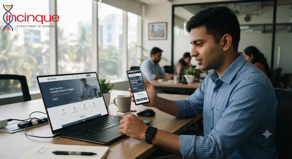
Even when a business site looks good on the desktop, it does not necessarily mean that it will have the same effect on a mobile device. In India, many people use mobile phones as their primary means of looking up businesses and comparing them, reading reviews, or even making inquiries.
That is why mobile website design becomes crucial for any business’s online presentation. An unpleasant user experience, slow loading time, and difficulties navigating through a website may cause visitors to leave without understanding what the business is offering.
The Website Should Adapt to Different Screens
Mobile web design must begin with responsive design. With responsive design, all aspects of the website from layout to text, images, buttons, and other elements adjust automatically depending on the size of the user’s screen.
The user must not be forced to zoom in or scroll horizontally to access vital information. The headings must remain legible, the images must fit into the screen, and the navigation must be intuitive enough for touch control.
The website must maintain the same quality of use whether viewed on smartphones, tablets, or computer screens.
Page Speed Matters
Sometimes, the internet connection that mobile devices have might not be very fast or stable. The use of heavy images, too much animation, many scripts and bad code optimization might make a website slow.
This might impact both the users and the search engine ranking of the website. It is important for businesses to optimize their website by compressing images and other things.
It is all about providing valuable information to visitors fast.
Navigation Should Be Simple
Visitors should be able to figure out where to go next without having to think about it too hard. Space on mobile devices is limited, and so confusing menus can become frustrating fast.
Such important pages as service and product pages, contacts, prices, and location should all be easily accessible. A clean menu and structured page organization will help greatly here.
Businesses shouldn’t hide vital information behind too many clicks.
Buttons Need to Be Easy to Use
Tiny buttons and tight links are typical design issues in mobile interfaces. While they might appear appropriate in a desktop interface, they can prove hard to click on in a smartphone interface.
The call-to-action button should not lack space and should also have clear labeling. Based on the nature of the business, there may be different call to actions such as calling, quotation request, scheduling an appointment, enquiry or chatting.
This must not leave the user in doubt on what he/she is supposed to do.
Content Should Be Easy to Read
A mobile user will normally scan through the pages rather than read each sentence. Big chunks of text may lead to poor navigation of the pages.
Firms can enhance readability by having shorter paragraphs, proper headings, appropriate bullet points and sufficient spaces between the different segments. The font sizes need to be friendly to the screen sizes too.
Writing clarity matters just as much as the visual appeal. An attractive page does not make up for bad content.
Local Businesses Need Mobile-Friendly Information
For Indian companies that operate in certain cities or areas, the visiting mobile customers may require some useful information like location, service area, telephone contact, hours of operation, etc.
The required information must be easily accessible. Contact information must not be hidden on several pages at the bottom.
As local search visitors have some purpose in mind, the mobile website should help in accomplishing the purpose of the visitor.
Why Many Business Websites Struggle
Some of these sites have been initially designed for computers and only later have been adapted for mobile. Others have a lot of graphics but lack speed, accessibility, navigation or proper layout.
One more thing to be careful about is cramming too many elements into one page. Mobile design requires prioritization. Companies should understand what the user needs.
Build for the User, Not Just the Screen
It involves more than just scaling down the website from the desktop version. Proper web design for mobiles demands proper layout, fast load, legible content, easy navigation, easily identifiable buttons, and easy actions.
Organizations that consider mobile users as their priority can develop web designs that are user-friendly and functional. For organizations that need help with developing an effective website strategy, design, development, and growth in the digital world, Incinque Agency can be contacted.