

- By Admin
- September 18, 2026
- UI/UX
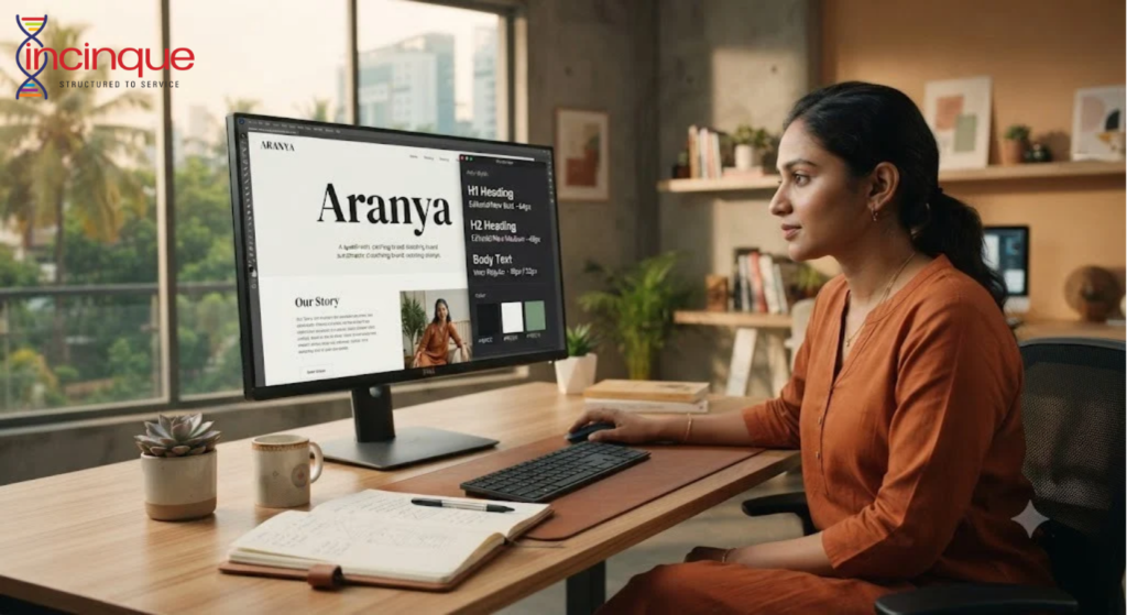
How Typography Makes Your Website Look More Professional
When visitors enter a website, they do not just pay attention to the pictures and colors displayed. They pay attention to the style of the fonts and text as well. Typography has a great influence on the first impression since it determines readability and the visual balance of the website.
The choice of the font is able to give the site its professional character, while bad typography will make even the best text unreadable. It should be noted that typography should be paid the same attention as the other aspects of the design.
Why Typography Matters in Web Design
Typography is the visual representation of written words. Typography encompasses the choice of the font, its size, weight, spacing, alignment, and how different text elements interact with each other.
While visiting a site, people usually first browse through its contents before making up their mind whether to read it all or not. Appropriate headings, good paragraph spacing, and readable fonts facilitate information browsing.
Moreover, typography brings about visual consistency. This occurs when the same design principles are applied throughout different webpages.
Choosing a Font That Fits Your Brand
It is important to understand that there is no one universal font that will be suitable for all businesses. The selection process should be based on the character of the brand, target audience, and industry.
If we talk about a technological company, its logo can have a modern and clean font, while a creative business can have a distinct font. Professional services might be represented by a very simple font that symbolizes clarity and professionalism.
However, visual character cannot be the main focus of attention and can compromise readability of the text.
Font Size Affects User Experience
The font size directly affects readability of the website by its visitors.
If the font is too small, then the user will need to zoom in, especially when browsing on the mobile device. If the font is too large, then the page will look awkward and will require more scrolling than it should.
The headings should be hierarchical. The primary heading must be distinct, whereas the subheadings should help to navigate the visitor through the sections. The body of the text should be comfortable to read.
Thus, the typography testing on desktop, tablet, and mobile phones is crucial.
Spacing Can Make Content Easier to Read
It’s not only the font that matters; the area around the text also impacts professionalism of the site.
Line spacing will keep paragraphs from being too tight. Letter spacing can be used to improve the look of headings. Section margins can increase readability of the page.
With proper spacing of text components, it will be easy for visitors to see the page structure. Improper spacing, however, will make the website look crowded even if there isn’t much content on it.
Keep Typography Consistent
It is not necessary to use many typefaces to create an attractive website. Too many fonts used might create inconsistency within the site.
The typographic system can be made up of a combination of two fonts, one for headers and the other for text; it can also involve the usage of only one font with various weights.
Other items like buttons, menu, form elements, product descriptions, etc., must adhere to the visual standards as well.
Avoid Common Typography Mistakes
There are several typography errors that may cause a website to look unprofessional. The use of excessively fancy fonts, bad color contrast, too much bold, unequal heading sizes, and cluttered paragraphs may impact the readability.
It is also not a good practice to design for desktop displays only. Since a lot of people use mobile devices to visit websites, the typography should be clear on small displays.
Another important point is to make sure that the font loads well on the website.
Typography and Brand Perception
While people might not be aware of analyzing typography in a website, they usually have a sense of whether a website is hard to read or looks messy.
Good typography enhances the message and does not distract from it. Typography makes understanding the information easier for visitors, sets hierarchy in the website design, and adds to the overall brand consistency.
Using the right typography, it is possible to make a website look sophisticated even without any fancy designs. For companies that want to enhance their websites, Incinque Agency provides services related to professional design and digital marketing.